Neurapix — Rebranding case study
A brand that has to sit next to someone else’s photography.
Neurapix edits in a photographer’s own style, so the brand has to sit on work it did not make. The mark is a lowercase n built from five bars that open like a shutter, warm yellow on black, and it holds from a browser tab to a billboard without competing with the picture behind it.
The brand it had was a gradient app icon in green and cyan: tidy enough, but cold, and with nothing photographic in it. We rebuilt it out of the camera instead. Focus brackets, crop marks, aperture halves and strips of film went on the board, and the n made of bars came off it. The palette moved from cool to warm, #FFC11F carrying the brand with #E32CF4 behind it.
The mark, at the size it has to survive
The test for this brand was never the logo on white. It is the logo on a picture somebody else took, read from across a street. Yellow on black holds there, and the bars stay apart instead of closing into a block.

A hero that is the logo, turned into a control
The mark is a row of bars widening into an n. The home page takes that idea and makes it something to touch: a wheel of photographs you can spin, frames running past the centre the way they run into the letter. The same shape twice, once standing still in the corner and once turning under your hand.
Features as a bento box
Six claims, six tiles, sized by how much each one matters, with the photography doing the arguing inside them. Playful without being loud: the yellow shows up once, on the arrow into the store, and every other panel earns its place with a picture or a number.
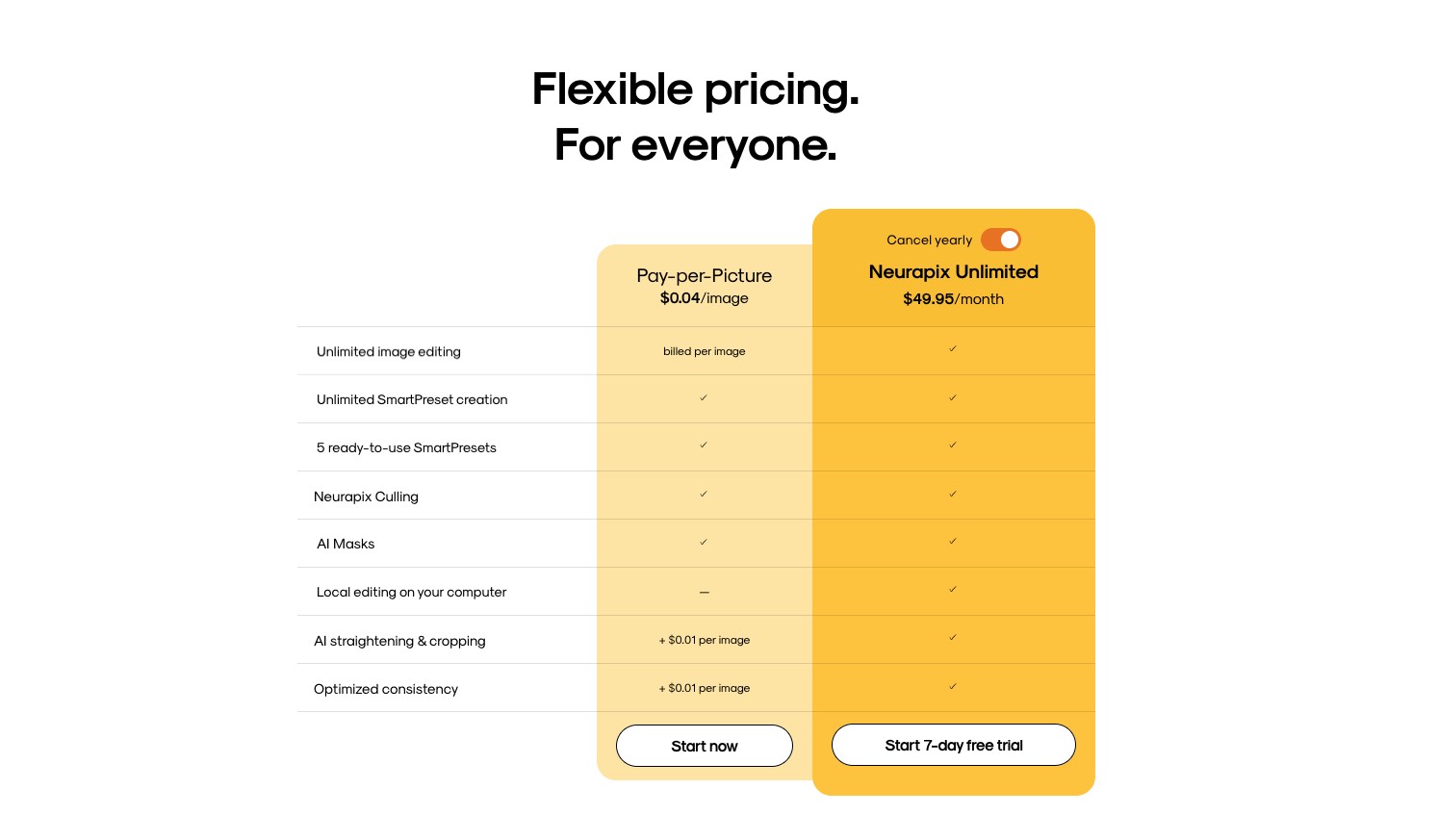
Pricing, in the new colour, with nothing hidden
Two plans and one table. The yellow does the pointing: the paid plan is the brand colour, the pay-as-you-go column is the tint above it, and everything else is black on white. Every line is a feature you either get or you do not.